When a web project grows, a question often comes up: how do we manage parts of the website without going insane? A very reasonable question, I might add.
At scale, source code needs "componentization". What it means, is the website is divided into independent components, the relation between a component and the rest of the website is clear and it's much easier for everybody to keep developing it.
Componentization can be easily achieved using a variety of frameworks (React, Vue, Angular... there's lots and lots of them). But it's not just a matter of frameworks.
After years of developing and managing websites, I'm seeing one area where componentization is virtually ignored - CSS. The components' ability to adjust to the web browsers' dimensions, specifically.
Every website nowadays is mobile- and desktop- ready, with very few exceptions. But it's incredibly rare to find components adjusting their dimensions to available space instead of the browser. These, therefore, are not truly independent components. Move them to some other place on the website and chances are all their CSS @media will have to be manually adjusted.
One reason, is that sizing a component according to available space is a relatively new concept and not much talked about. It's also recently become faster, thanks to this trick.
Another - it's tougher to adjust to available space than browsers' size.
Third - the benefit of clearing @media from CSS is usually minor. In practice, components are rarely moved around enough to justify an investment in greater adjustability. Throw some developers at the problem when it happens, instead.
So why bother doing it.
Why It's A Good Idea
One good reason is compatibility. Corporations often create a separate library with reusable components. It can be imported to websites they develop, often tens of websites, and enforces a high degree of UI and UX compliance. If relieves developers from having to read through tons of documentation and recreating popular components. In my experience, these tend to be pretty rigid, still. An open source comparison is Bootstrap. It's awesome, as long as components are used exactly inside their supported contexts. Component 1 can be placed inside component 2 or 3, or else the website falls apart.
Many projects which use Bootstrap suffer the same fate. They get heavily modified, because components don't support some context and look out of place in it. I've seen this over and over again.
One solution is to generalize and get rid of these limitations entirely and have components respond to whatever context their in. Specifically, have them detect their own size.
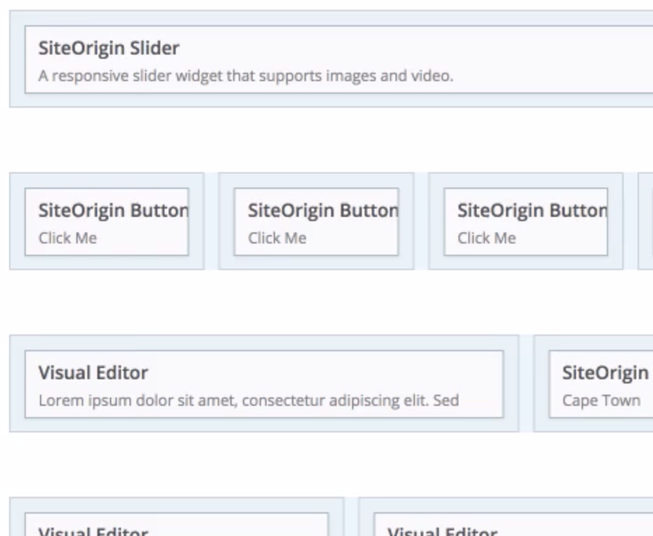
Another reason to make components more independent of the browser's state are CMSs with a fluid page layout. Sitefinity CMS supports this kind of layout and Page Builder adds to WordPress. It's impossible to know upfront, how components will be used in these systems. The may be placed one after the other and row by row, but also next to each other in a four column grid.
How To Implement
React SizeMe is a particular implementation of "the trick" mentioned earlier, adapted specifically for React. It's a simple wrapper for React components which provides updated sizing info to them so they can adjust themselves accordingly. I'm sure there are others for different frameworks.